Using principle-based design evaluation to drive product enhancement
When redesigning a self-service portal, I needed to prioritise the highest value improvements to work within budget, but also keep a strategic end-goal in sight.
Using design principles to generate insights, I prioritised a design roadmap that fed the product backlog, worked on redesigns with an iterative design plan, and added to content and accessibility guidelines to achieve consistency.
The challenge
Inform requirements for an experience uplift
Evaluate design using ‘rules of thumb’ heuristics
Prioritise by customer and business value
Redesign in stages to manage resources
The problem to solve
Applicants need to resolve blockers quickly to avoid delays and lost opportunity
Application delays were a risk to business revenue potential
Feedback themes were usability, accessibility, mobile experience and process fit
Enquiries needed to be sent to the right place to avoid processing delays
Approach
Working with lean and agile principles, I needed to focus my design efforts on the highest value improvements:
Review against industry-recognised design heuristic conventions
Collaborate with stakeholders and experts to prioritise improvements
Order a backlog by business viability, technical feasibility and UX desirability
Design an iterative hypothesis to address the highest priority improvements
Key takeaways
422 opportunities for improving the design, content, and accessibility
158 high value and high impact issues were prioritised
100 issues were directly related to accessibility compliance
20 issues selected for proof-of-concept redesign
Building the case for redevelopment
After commencing the review, it was clear configuration alone would not address enough of the issues found, and that to achieve accessibility targets, the effort would exceed the available resources.
Ordering the backlog
Issues were prioritised by business viability, UX desirability, and build feasibility
The highest priority issues were estimated and added to the product backlog
Additional work orders were created for redevelopment to address the backlog
Remaining work was added to the design roadmap and guidelines created
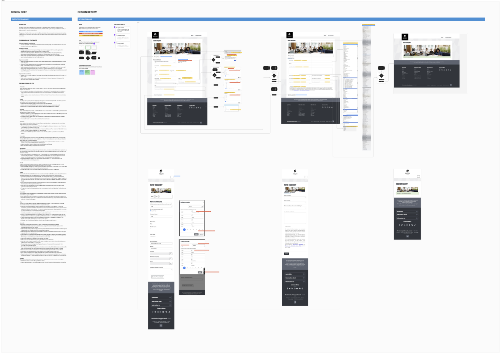
The following example shows how the review was applied to redesign a contact form.
Contact form redesign
Current state review
I started redesign tasks using the design review and backlog to break down the big design piece into smaller units of work. As an example, here’s a summary of the design review for the contact form.
Guidelines needed
Writing style inconsistencies included use of passive language, inconsistent sentence case, inconsistent first-person references (“your”, “my”, “their”), and inconsistent proper noun capitalisation
Design inconsistencies included the use of components mismatched to the type of question, like pull down lists with hundreds of options, and checkbox components used when a radio control was more appropriate.
Simplified form design
A single column form layout was needed to reduce the risk of omission errors
The number of questions needed to be reduced to fit on a single page, by conditionally hiding irrelevant questions, and removing the unnecessary information gathering
On-screen instruction was needed to explain what information was needed, but instructions for how to use a web interface (e.g., ‘click below’) were not needed.
Improved accessibility
Pull-down option select elements were not accessible when used to show hundreds of options
Unanswered mandatory questions should not have had a valid answer selected by default, so that omission errors would be detected
Temporary placeholder text should not have been used for instructions because they disappeared. Persistent helper text was needed for error correction (e.g., to explain phone number formats).
Mobile experience
Ineligible text that appeared partially off screen and text that was obscured under overlapping elements reduced form usability
A responsive design was needed to re-flow wide content to fit the screen, and replace fixed width tables that did not resize
The mobile navigation needed redesign so that navigation links were usable and not obscured off-screen
The mobile header needed redesign. One quarter of the mobile screen was filled with unused white space that displaced useful content.
Design review excerpt showing screen shots for a contact form marked up with categorised issues.
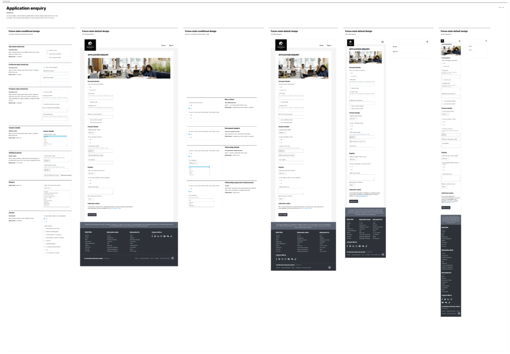
Using Figma and a design system based on Fluent, I needed to redesign components to address the accessibility issues and improve mobile compatibility.
The design had to accommodate two states: a future state, and an operational state:
Future state: a strategic end-user focussed design that addressed 422 issues and achieved WCAG 2.2 AA success criteria with a contemporary design system
Operational state: a design iteration, collaborated with product and technical teams, based on a prioritised roadmap of 20 of 422 improvements and the legacy design system.
The redesigned contact form
Reduced redundant form choices from 600 options to 20 options
Responsive and mobile compatible, and WCAG 2.1 AA accessibility improvements
Content consistent with writing style guidelines.
Mobile and desktop handover document for a contact form redesign, showing responsive components and conditional variations.