Case studies

Accelerated product uplift with lean UX

A Lean UX review transformed hundreds of issues into a prioritised investment roadmap.

Focus areas
  • Product Design
  • Service Design
  • Education
Client
University of Newcastle
Role
Service Experience Designer
Tools
Figma, Miro, Desirability-Viability-Feasibility matrix
  • 422 Improvement opportunities

    Identified across design, content, accessibility, and mobile experience.

  • 158 Priority issues

    High-value improvements prioritised by viability, desirability, and feasibility.

  • 100 Accessibility issues

    Compliance-related issues identified and addressed through redesign recommendations.

  • 20 Redesign concepts

    Highest-priority improvements selected for proof-of-concept and roadmap delivery.

Problem Discovery

The problem to solve

Applicants needed to resolve blockers quickly to avoid delays and lost opportunity. The service made that harder than it needed to be: feedback themes showed problems with usability, accessibility, mobile experience and process fit.

The stakes were not only experiential. Application delays created a risk to business revenue potential, and enquiries needed to reach the right team quickly to avoid processing delays.

The initial question was whether the experience could be improved through configuration and content updates. The review showed a larger pattern: the product had accumulated design debt that needed to be prioritised, not simply patched.

Strategy & Architecture

My role

I was responsible for reviewing the current experience, identifying and categorising issues, shaping the prioritisation approach, and designing proof-of-concept improvements for high-value problem areas.

I worked with product, business and technical stakeholders to turn the findings into a roadmap that balanced customer value, business viability and build feasibility. I did not own final delivery decisions, but influenced roadmap and redevelopment conversations by making the scale, severity and trade-offs visible.

Prioritise impact instead of trying to fix everything

The review uncovered 422 opportunities. Treating every issue as equally urgent would have overwhelmed the team and made it harder to decide where limited budget and delivery capacity should go first.

I recommended ordering the backlog through a desirability, viability and feasibility lens. This separated high-value product improvements from lower-priority clean-up work and helped the team focus on the changes most likely to improve the applicant experience and support business goals.

  • Reviewed against industry-recognised design heuristic conventions
  • Collaborated with stakeholders and experts to prioritise improvements
  • Ordered the backlog by business viability, technical feasibility and UX desirability
  • Designed an iterative hypothesis to address the highest priority improvements

Concept & Wireframing

Future state and operational state

The design direction needed to support two realities: a better future-state experience and an operational-state iteration that could work within existing constraints. Using Figma and a design system based on Fluent patterns, I needed to redesign components to address the accessibility issues and improve mobile compatibility.

Future state
A strategic end-user focused design that addressed the full review findings, supported WCAG success criteria and used a contemporary design system based on Fluent patterns.
Operational state
A practical iteration shaped with product and technical teams, focused on 20 priority improvements from the roadmap and designed within the limits of the legacy design system.

Evidence from the review

The contact form review helped make the broader product issues tangible. It showed how content, interaction design, accessibility and responsive behaviour were combining to slow applicants down.

Content guidelines were needed

  • Writing style inconsistencies included passive language, inconsistent sentence case, mixed first-person references and inconsistent proper noun capitalisation
  • The fix was not only rewriting content, but creating reusable guidance so future screens could stay consistent

Form structure needed simplification

  • The form needed a single-column layout, fewer questions and conditional logic to hide irrelevant fields
  • Interface instructions such as “click below” could be removed, while task-specific guidance needed to remain visible

Accessibility issues were structural

  • Select menus with hundreds of options were not suitable for the task
  • Mandatory questions needed no default valid answer, and placeholder text could not carry instructions because it disappeared when users started typing

Mobile usability needed redesign

  • Text appeared partially off screen, overlapping elements obscured content, fixed-width tables did not resize, and the mobile header displaced useful screen space
  • The solution required responsive design, not cosmetic adjustment
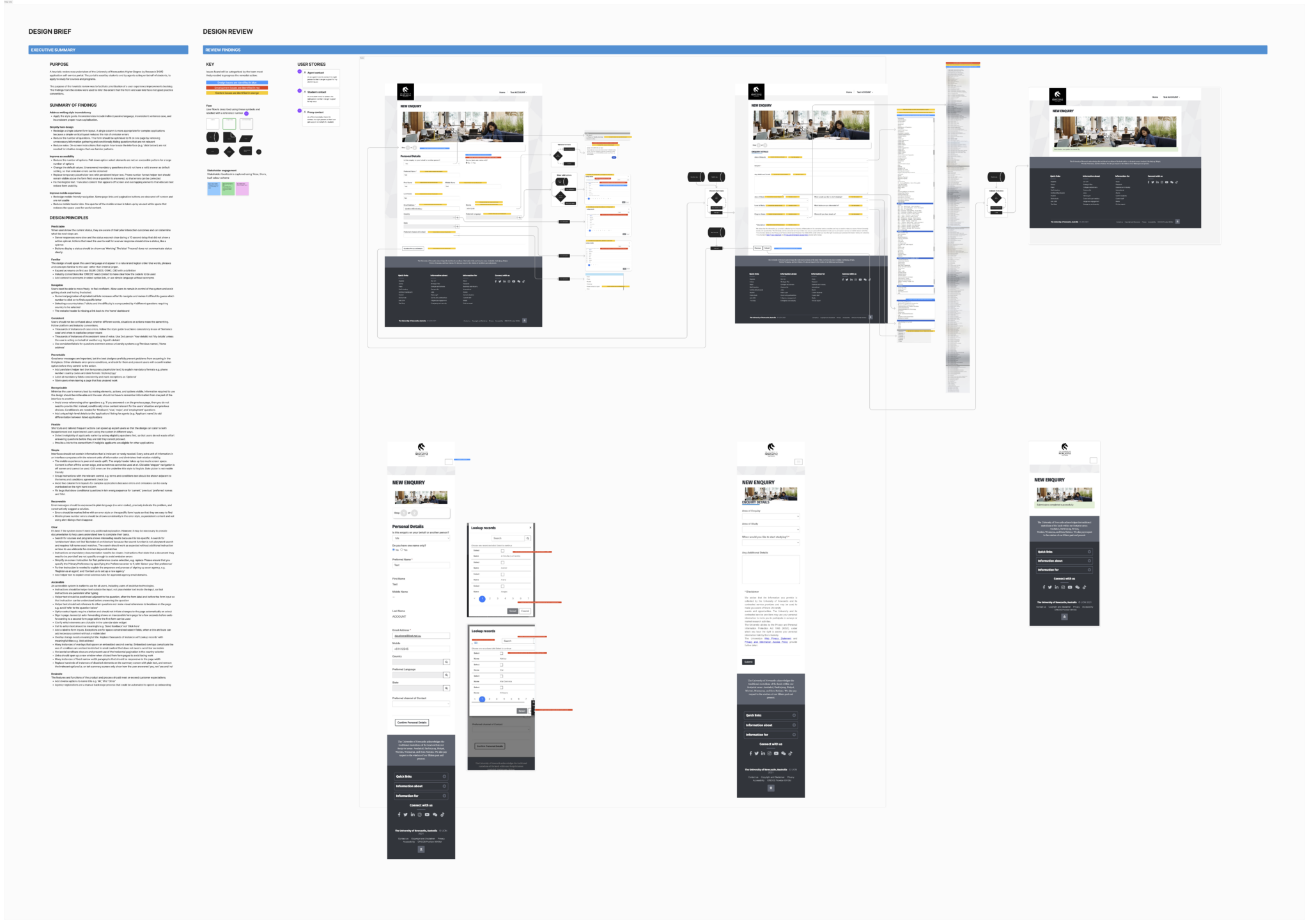
An excerpt from a design review showing screen shots of the current state desktop and mobile designs, and conditional states of interactive elements.
Design review excerpt showing current-state desktop and mobile screens, conditional states and categorised issues.Overview of one of three review boards — select to view at full size.

Validation & Refinement

Using the review as evidence for redevelopment, not just remediation

The obvious move was to keep improving the current service through configuration changes. That would have addressed some visible issues, but it would not have resolved enough of the accessibility, mobile and structural problems found in the review.

I used the prioritised findings to build a clearer case for redevelopment. The trade-off was that redevelopment required more stakeholder alignment and delivery investment. The benefit was a more honest path to meeting accessibility expectations and improving the service at the system level.

Ordering the backlog

To make the best use of budget, I needed to prioritise the issues found in the design review. I used a desirability-viability-feasibility matrix to order the issues by business value and user experience impact.

  • Issues were prioritised by business viability, UX desirability, and build feasibility
  • The highest priority issues were estimated and added to the product backlog
  • Additional work orders were created for redevelopment to address the backlog
  • Remaining work was added to the design roadmap and guidelines created

Simplifying the form rather than optimising a broken structure

The contact form exposed the product’s broader problems in one place: inconsistent content, inaccessible controls, mobile layout issues and hundreds of possible choices that made the experience harder to complete.

Instead of polishing the existing design, I redesigned the information architecture around fewer choices, conditional disclosure, clearer helper text and responsive layouts. This reduced the risk of omission errors and made the form easier to understand across desktop and mobile breakpoints.
Handoff & Iteration

Preparing responsive designs

The final designs were documented across mobile and desktop breakpoints, with each component annotated for responsive behaviour, spacing, and interaction states. This gave developers a clear implementation reference and reduced ambiguity during delivery.

Establishing a design system

Reusable components were organised into a shared Figma library with consistent naming, auto-layout properties, and token-linked styles. I also worked with developers during sprint planning to clarify design intent, resolve edge cases and keep the build aligned with the proposed experience.

What changed

  • 422 issues documented across UX, accessibility and content
  • 158 high-value improvements prioritised by business viability, UX desirability and build feasibility
  • 100 accessibility issues identified
  • 20 proof-of-concept redesign opportunities selected
  • Redevelopment opportunities added to the roadmap
  • Contact form choices reduced from 600 options to 20 clearer pathways
  • Mobile compatibility improved through responsive layout guidance
  • Content aligned to clearer writing guidelines

The project turned a large set of isolated issues into a practical improvement roadmap. More importantly, it gave stakeholders a shared evidence base for deciding where product investment would have the greatest impact.

Reflection

The biggest lesson from this project was that prioritisation can be as valuable as redesign. The issue list mattered, but the real value came from helping the team understand which problems were worth solving first and why.

If I approached this again, I would bring engineering effort estimates into the prioritisation process earlier. That would make redevelopment pathways clearer sooner and help stakeholders compare near-term fixes against longer-term product investment.

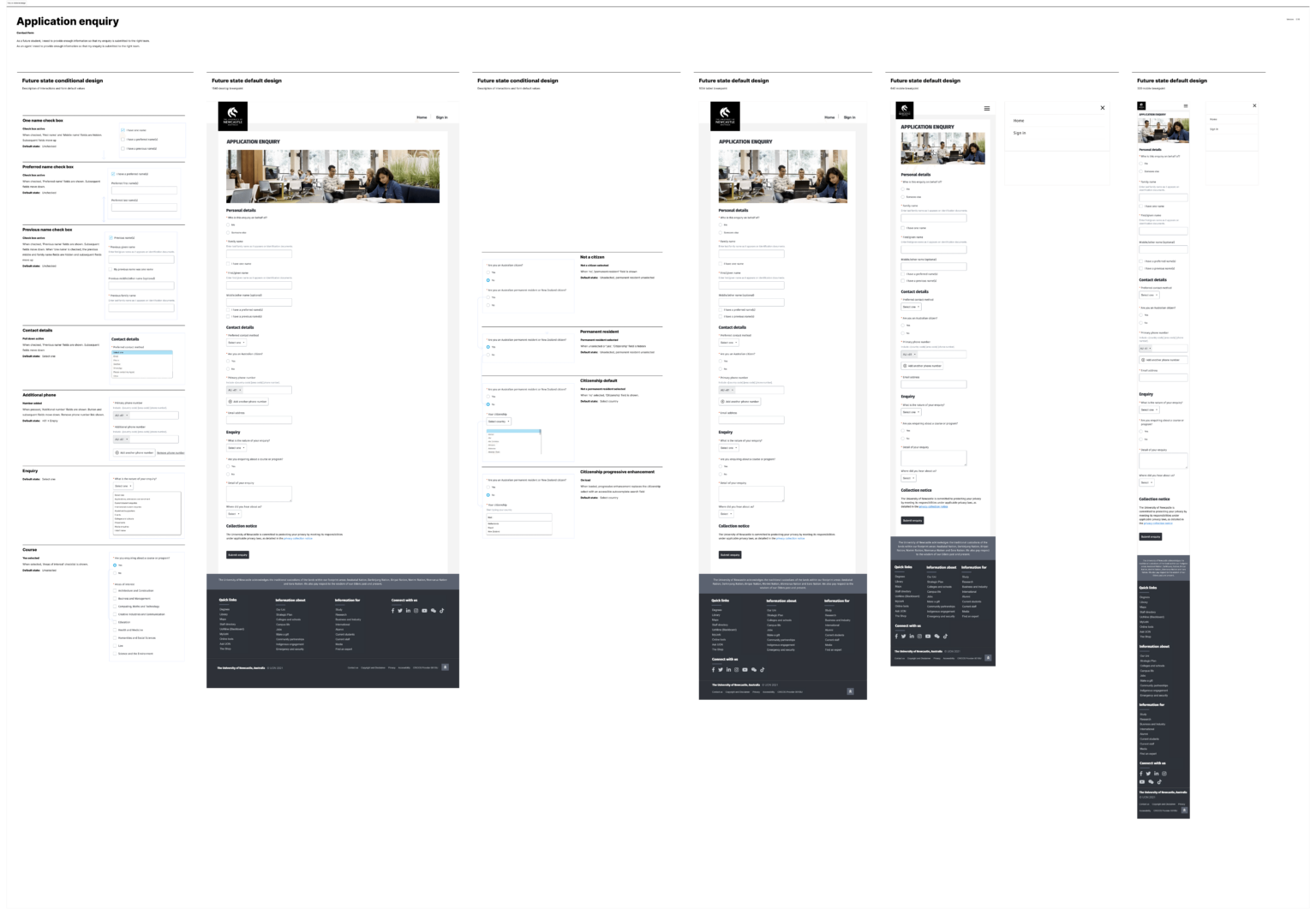
Excerpt from a design handover document showing responsive break points, content modules and conditional variations.
Handover excerpt showing responsive breakpoints, content modules and conditional variations for the redesigned contact form.Overview of the handover board — select to view at full size.